Hi there friends!
Today I want to share a new page with a couple of the latest collections from Norwegian manufacturer Papirdesign.
Thiose of you who are followers of Papirdesign on Facebook will have seen some pictures of the latest collection from the fair and I can tell you they are just as pretty in real life :-)
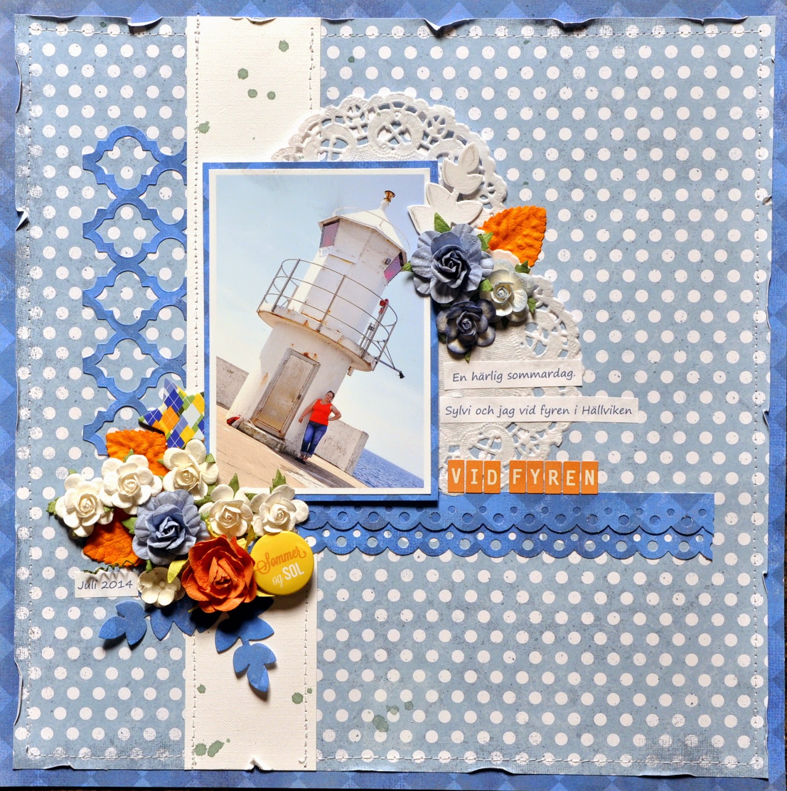
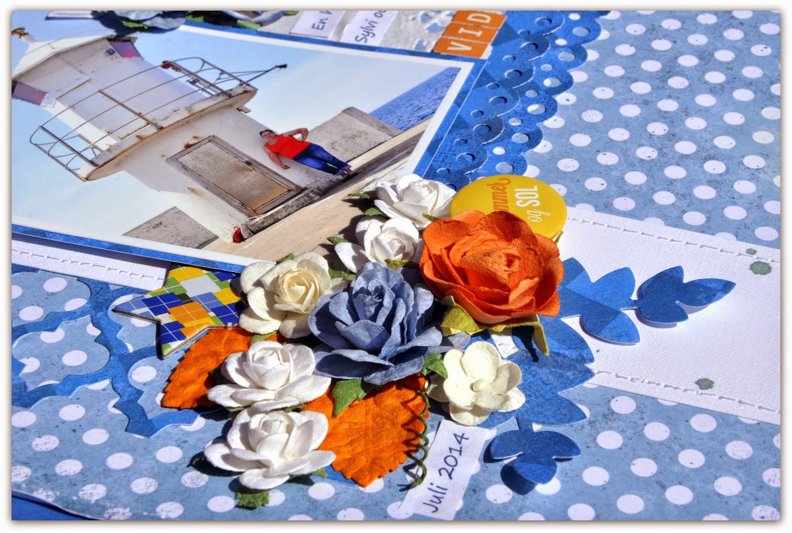
The lovely blue tones look pretty with this picture taken by my lovely sister on a recent holiday here. I picked the orange from my t-shirt in the picture and must say that to me it's a winning combination! :-)
For this page I found that the set with summerbuttons is perfect and of course even here the colour is a great match!

To add to the seaside feeling of my page I glued down a couple of punched pappers strips. I think they look a little like waves,...don't you? Extra added details are the diecut Frameworks Trellies and the leaves from a Framelits set from Sizzix.

Thanks for looking in! Hope I'll see you here again soon!
I have used
Marias Verden-Gaver
Lille Mirakel
Blue roses,
blueand white miniroses,
button,
chipboardstar,
alphabets,orange
Such a beautiful photo and page - love the angle!
ReplyDeleteIt's a really beautiful summer lay-out! I just love the clean look of it and the summery colours.
ReplyDeleteStunning Bente! Love the blue and orange combo and the amazing photo! I love lighthouses......perfection!!! ;-)
ReplyDeleteGorgeous. Stunning flower cluster...love the pop of orange xx
ReplyDelete